Contrary to popular belief, fighting a low ceiling isn’t about painting everything white. The key is to master optical illusions that control sightlines and sculpt the perception of space.
- Vertical rhythms, not just simple stripes, are crucial for drawing the eye upward and altering perceived proportions.
- Low-profile furniture creates a “false horizon,” maximizing the visible wall height above and giving the room a sense of buoyancy.
Recommendation: Start by treating light as a sculpting tool, not just an illuminator. Layering it erases corners and creates an atmospheric depth that makes the ceiling feel distant.
Living in a space with a standard 2.4-meter (8-foot) ceiling can feel like wearing a perfectly good suit that’s just a size too small. It’s functional, but you’re constantly aware of a subtle constraint, a sense of compression. The common advice is a familiar chorus: paint the ceiling white, hang curtains high, and use vertical stripes. While not wrong, these are surface-level tactics. They are the equivalent of standing up straighter, but they don’t fundamentally change the architecture of perception.
The true power to transform a cramped room into an airy volume lies not in decoration, but in illusion. As a spatial architect, the goal is to stop fighting the physical dimensions and start directing the occupant’s eye. It’s about becoming a magician of space, manipulating light, scale, and rhythm to craft a new reality. The most effective strategies are often counter-intuitive, leveraging the very psychology of how we perceive depth and height. We are not just painting walls; we are scripting sightlines and sculpting with shadows.
This guide moves beyond the checklist of tired tricks. We will deconstruct the architectural principles that make these illusions work, from the science of verticality to the strategic use of color saturation. You will learn to think not like a decorator, but like a spatial strategist, turning your low ceilings from a liability into an invisible asset.
To master these techniques, this article breaks down the core architectural illusions into distinct, actionable principles. We will explore how to manipulate volume, scale, light, and flow to fundamentally reshape your experience of the space.
Summary: Architectural Illusions for Expanding Perceived Space
- Why Vertical Paneling Changes the Perceived Volume of Small Rooms?
- How to Scale Furniture for Large Rooms to Avoid the ‘Dollhouse Effect’?
- Open Concept vs Broken Plan: Which Layout Maximizes Usable Volume?
- The Storage Mistake That Consumes 20% of Your Visual Floor Space
- Sequence & Planning: Designing Traffic Flow Through High-Volume Areas
- Why Single-Source Overhead Lighting Increases Visual Fatigue in Home Offices?
- The Saturation Mistake That Makes Small Rooms Feel Claustrophobic
- How to Style Open Shelving Without It Looking Cluttered and Messy?
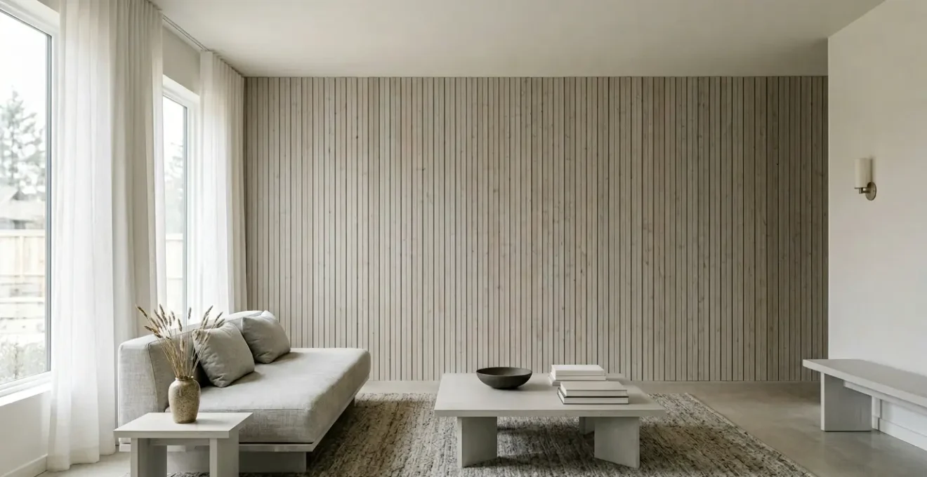
Why Vertical Paneling Changes the Perceived Volume of Small Rooms?
The advice to “use vertical stripes” is a dramatic oversimplification of a powerful psychological principle. The real magic lies in creating a strong visual rhythm that forces the eye to travel upward. It’s not the pattern itself but the repeated, uninterrupted movement it encourages. Thin, floor-to-ceiling vertical paneling, shiplap, or even carefully spaced battens create a cadence that the brain instinctively follows from floor to ceiling, elongating the perceived height of the wall.
This isn’t just an aesthetic opinion; it’s rooted in perceptual psychology. The vertical–horizontal illusion is a well-documented phenomenon where vertical lines are consistently perceived as longer than horizontal lines of the exact same length. By emphasizing the vertical axis with physical texture and shadow lines, you are directly exploiting this cognitive bias to your advantage. The wall doesn’t just look taller; to the human eye, it *feels* taller.
As this detailed view shows, the effect is magnified by texture and the subtle shadows cast between each panel. This micro-contrast adds depth and reinforces the upward direction, making the illusion far more potent than a simple painted stripe. The goal is to make the vertical journey so compelling that the eye doesn’t even register the ceiling’s actual height. You are creating a forced perspective that redefines the perceived volume of the room.
How to Scale Furniture for Large Rooms to Avoid the ‘Dollhouse Effect’?
One of the most common mistakes in rooms with low ceilings is choosing furniture that is proportionally too tall. High-backed sofas, towering bookcases, and bulky media centers “eat” the vertical space, visually lowering the ceiling and creating a cramped, dollhouse-like feeling. The key is to select pieces that intentionally leave a generous amount of visible wall space between the top of the furniture and the ceiling.
As a leading design expert from Homes & Gardens wisely points out, the strategy is about maximizing what you can see. They state in their analysis on creating height:
Because the lower the furniture – and the less distracting it is – the more wall above it you can see, making the ceiling seem taller.
– Homes & Gardens Design Expert, Interior Design Analysis on Low Ceiling Tricks
This creates a distinct “horizon line” in the room. By keeping the dominant furniture pieces low to the ground, you establish a consistent visual datum line. The expansive, uninterrupted wall space above this line becomes the focus, giving the illusion of a much taller room. Furniture with visible legs—or “leggy” furniture—enhances this effect by creating a sense of buoyancy and allowing the floor to be seen underneath, which further increases the sense of volume.
Action Plan: The Low-Profile Furniture Strategy
- Select furniture with a lower profile and clean, uncluttered lines that occupy less vertical wall space.
- Choose pieces that sit low to the ground, such as sofas or consoles on tall legs, to maximize the gap between the furniture and the ceiling.
- Create a consistent ‘horizon line’ with major pieces under 30-32 inches (approx. 76-81 cm) to maximize uninterrupted wall space above.
- Opt for ‘leggy’ furniture with visible floor space underneath to create a sense of buoyancy and a larger perceived volume.
- Maintain a harmonious relationship with room proportions by avoiding towering bookcases and high-backed sectionals that break the clean horizon.
Open Concept vs Broken Plan: Which Layout Maximizes Usable Volume?
The instinct to tear down walls to create an open-plan living area seems logical for maximizing space. However, in a home with low ceilings, this can backfire spectacularly. When you create a vast, sprawling horizontal plane under a low ceiling, you can distort the room’s proportions, making it feel wide but unpleasantly flat, like a tunnel or a pancake. The increased width makes the low height even more apparent.
This is a subtle but critical architectural misstep. As architectural designer Mark Gettys explained in an interview with Living Etc, proportion is everything:
One common and less obvious mistake I’ve seen is the proportion of the open plan relative to the ceiling height. If you open the space too much, the height-to-width proportion is off and the space feels tunnel-like and sprawling.
– Mark Gettys, Architectural Designer, Living Etc Interview
The more sophisticated solution is often a “broken plan” layout. This approach maintains the sense of openness and light flow but uses subtle architectural cues—like partial walls, glass partitions, changes in floor level, or even varied ceiling heights—to define zones. This creates curated sightlines and pockets of perceived height, a strategy far more effective than a uniform open space.
Case Study: The Power of Modulated Ceiling Heights
In a remodel by Whittaker Parsons, a “broken plan” was used to great effect. By subtly varying ceiling heights across an open living, kitchen, and dining area, they signaled changes in function. A slightly lower ceiling over a cozy TV area made that zone feel more intimate, while the main living space retained its height. This modulation, combined with strategic light-scaping in each zone, creates curated views and a dynamic sense of volume that would be impossible in a uniformly lit, fully open-plan room.
The Storage Mistake That Consumes 20% of Your Visual Floor Space
Beyond furniture, the biggest culprit in visually shrinking a room is poorly considered storage. The common mistake is relying on bulky, floor-based units: wide dressers, deep media consoles, and solid-base bookcases. These pieces act as visual anchors, weighing the room down and, more importantly, consuming a significant portion of your visible floor area. It can feel like this type of storage consumes up to 20% of the visual floor space, making the room’s footprint feel substantially smaller.
The architectural solution is to defy gravity. Your storage strategy must move vertically and, wherever possible, “float.” By choosing wall-mounted shelving, floating consoles, and tall, narrow bookcases, you achieve two critical illusions. First, you liberate the floor. Seeing the flooring run uninterrupted underneath a unit tells the brain the room is larger and more open. Second, you draw the eye upward, reinforcing the vertical axis we’ve established is key to creating perceived height.
Think of it as reclaiming visual territory. A wall-mounted media unit instead of a chunky floor console instantly gives back square meters of perceived space. Opt for storage that is the same color as the wall it’s on. This allows it to “disappear,” reducing its visual weight and preventing it from breaking up the clean vertical plane of the wall. The goal is for storage to be a seamless, integrated part of the architecture, not a collection of heavy objects squatting on your floor.
Sequence & Planning: Designing Traffic Flow Through High-Volume Areas
How you arrange furniture in a room does more than define function; it scripts the movement of the eye. In a low-ceilinged room, a standard grid-like layout, with furniture squared up against the walls, creates short, predictable sightlines that terminate quickly, emphasizing the room’s boxy proportions. A more visionary approach is to design the psychological sightlines to be as long as possible.
The most powerful way to do this is to arrange your main furniture pieces on a diagonal axis. By placing a sofa or seating group at an angle, you force the eye to travel from one far corner of the room to the other. This diagonal path is inherently longer than the room’s width or length, tricking the brain into perceiving a larger, more dynamic space. You are creating a “gaze path” that exploits the longest possible dimension of the room.
As this perspective shows, the diagonal arrangement opens up the space and creates a natural, flowing traffic path. The negative space is no longer trapped in corners but becomes an active part of the room’s design. To maximize this effect, place a tall, slim element—like a floor-to-ceiling mirror, a slender floor lamp, or a tall plant—at the end of this diagonal sightline to serve as a visual destination, further encouraging the eye to travel the full distance.
Why Single-Source Overhead Lighting Increases Visual Fatigue in Home Offices?
A single, central overhead light fixture is an architectural disaster in a room with a low ceiling. It creates a “pool” of harsh light directly below it and casts deep shadows in the corners and upper portions of the walls. This high-contrast environment, known as the “cave effect,” not only makes the ceiling feel lower and the room smaller but is also terrible for your well-being. This kind of lighting is a primary contributor to eye fatigue, especially in a home office setting, where research shows nearly 3 out of 4 office workers experience digital eye strain.
The goal is to wash the walls with light, a technique called light-scaping. This means using multiple, indirect light sources to create a layered and balanced ambiance. The Illuminating Engineering Society (IES) has noted the powerful psychological impact of this approach:
According to the Illuminating Engineering Society (IES), intense direct light from above creates a tense feeling. On the other hand, lower overhead lighting combined with warm-toned lighting at room perimeter creates a relaxed feeling.
– Illuminating Engineering Society (IES), Impact of Lighting in Office Psychology
To achieve this, you must adopt a three-point lighting strategy that erases shadows and lifts the space:
- Ambient Layer: Use wall sconces, cove lighting, or floor lamps that direct light upwards (uplighting). This bounces light off the ceiling and washes the upper walls, making the corners disappear and the ceiling feel higher.
- Task Layer: For work areas, add a focused, adjustable desk lamp. This provides direct light where you need it without creating harsh glare elsewhere.
- Accent Layer: Use small, targeted lights to highlight artwork, plants, or architectural features. This adds depth and visual interest, drawing the eye around the room rather than just to the center.
The Saturation Mistake That Makes Small Rooms Feel Claustrophobic
The age-old rule to “paint small, dark rooms white” is perhaps the most pervasive and misunderstood advice in interior design. While light colors do reflect light, using them exclusively can sometimes result in a bland, featureless box where the room’s tight dimensions are all too clear. A far more daring and effective strategy is to embrace darkness and saturation to create an illusion of infinite depth.
This counter-intuitive approach works by blurring the lines where walls and ceiling meet. A dark, matte color absorbs light, making corners and edges recede. This is a tactic used by theater set designers to make a small stage feel vast. As interior designer Lucinda Loya notes, fear of the dark is a missed opportunity:
Don’t shy away from darker colors – contrary to popular belief, darker tones can create depth, making the ceiling appear endless.
– Lucinda Loya, Founder and Principal of Lucinda Loya Interiors
The key is to commit fully. Painting the walls a deep navy, charcoal, or forest green and—crucially—painting the ceiling the exact same color creates a seamless, monolithic space. The boundaries of the room dissolve. Without a contrasting white ceiling to stop the eye, the gaze travels up and into an ambiguous darkness, giving the impression of a boundless, night-sky-like expanse. This technique turns the room into an immersive, jewel-box environment where the low ceiling is no longer a bug, but a feature.
Key takeaways
- The core principle is to control the eye’s movement, using vertical rhythm and long sightlines to create a perception of height and space.
- Low-profile, “leggy” furniture establishes a clear “horizon line,” maximizing visible wall space and giving the room a sense of buoyancy.
- Layered lighting is a non-structural tool to “sculpt” space, eliminating shadowy corners and washing walls with light to make the ceiling recede.
How to Style Open Shelving Without It Looking Cluttered and Messy?
Open shelving is a fantastic way to add storage without the bulk of traditional cabinetry, but it’s a double-edged sword in a low-ceilinged room. If styled incorrectly, it can become a horizontal band of visual clutter that weighs the entire room down and draws attention to the lack of height. The secret to successful shelving is to treat it not as storage, but as a canvas for vertical composition.
Every object placed on a shelf should contribute to an upward visual thrust. This means abandoning horizontal arrangements in favor of vertical ones. Instead of spreading items out, group them into “towers” of varying heights. This philosophy turns a collection of objects into a curated landscape that guides the eye up, up, and away.
To execute this with architectural precision, follow a few core rules for vertical styling:
- Rule 1: Prioritize Vertical Arrangements. Stack books vertically instead of horizontally. Use tall, slim vases and group smaller objects together to form taller visual masses.
- Rule 2: Apply Color Zoning. Place lighter and cooler-colored objects on the top shelves, with slightly darker or warmer colors on the bottom. This subtle gradient creates a sense of lightness at the top.
- Rule 3: Mandate Negative Space. At least one-third of the total shelf surface must be left empty. This “breathing room” is critical. It signals intentionality and prevents the visual clutter that makes a room feel smaller and more chaotic.
- Rule 4: Position for Height. If installing new shelves, place them slightly closer to the ceiling than you normally would and keep them sparsely decorated to maximize their eye-lifting effect.
By integrating these principles, you move from merely decorating a room to architecting an experience. You are no longer a victim of your room’s physical dimensions but the master of its perceived volume. Begin today by choosing one of these illusions and applying it. You are not just re-styling your apartment; you are sculpting perception and fundamentally reclaiming your space.