In summary:
- True open-plan zoning is an electrical strategy, not a decorative one. It starts with separating functions onto different circuits.
- Mastering the three layers—Ambient, Task, and Accent—allows you to build a “visual hierarchy” that guides the eye and defines space.
- Technical properties like Kelvin (temperature), CRI (color accuracy), and beam angle are the tools you use to sculpt distinct atmospheres for each zone.
- Solving common issues like flicker, shadows, and color distortion requires understanding the physics of light and the compatibility of your hardware.
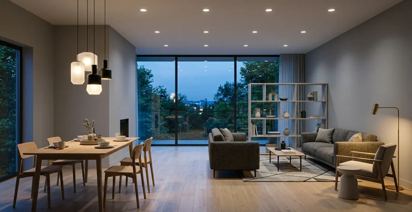
That sprawling open-plan living area—the dream of seamless flow from kitchen to dining to lounge—often comes with a hidden drawback. When night falls, the single, vast space can feel undefined, cavernous, and strangely uninviting. The common response is to add floor lamps or change a lampshade, treating lighting as a decorative afterthought. This rarely solves the core problem because it ignores a fundamental principle: effective zoning is not about furniture, it’s about engineering light itself.
The true power to define your space lies within your walls, in the electrical circuits. By thinking like a lighting designer, you can use circuits to create “psychological boundaries” and craft distinct functional zones without building a single wall. This approach moves beyond simply making things visible; it’s about sculpting with light and shadow, painting with color temperature, and building an invisible architecture of ambiance. It’s the difference between a brightly-lit warehouse and a home composed of multiple, inviting destinations within a single volume.
This guide will deconstruct the engineering behind professional lighting design. We will explore how to layer light with technical precision, select the right control systems, and master the physical properties of light to solve common problems like visual fatigue and unflattering color rendering. By the end, you will have the framework to transform your open-plan area from a single, monotonous room into a dynamic and multi-functional living environment.
To navigate this technical yet accessible approach, here is a breakdown of the key lighting principles we will illuminate. Each section builds upon the last, providing a complete system for mastering your space.
Summary: The Complete Guide to Engineering Light for Open-Plan Zoning
- Why Single-Source Overhead Lighting Increases Visual Fatigue in Home Offices?
- How to Layer Ambient, Task, and Accent Lighting in a 20m² Kitchen?
- Smart Switches vs Rotary Dimmers: Which Is Best for Multi-Zone Rooms?
- The Kelvin Temperature Mistake That Makes New Kitchens Look Sterile
- Where to Position Pendant Lights Over an Island to Avoid Shadows?
- Open Concept vs Broken Plan: Which Layout Maximizes Usable Volume?
- Why Your Grey Paint Looks Purple in the Morning Light?
- Why Do Some LED Bulbs Flicker When You Dim Them Below 30%?
Why Single-Source Overhead Lighting Increases Visual Fatigue in Home Offices?
The most common lighting mistake in any space, but especially in a home office zone, is relying on a single overhead fixture. This “light bomb” approach creates a flat, high-contrast environment that is a primary cause of visual fatigue and headaches. When your screen is a bright rectangle and the surrounding desk is in relative shadow, your eyes are forced to constantly readjust, leading to strain. This is a key contributor to what is now a widespread issue; a comprehensive 2024 review confirmed that up to 69% of the population is affected by Computer Vision Syndrome, a condition exacerbated by poor lighting contrast.
This fatigue is caused by two main factors: glare and uniformity. A single overhead source often creates veiled glare on your screen, washing out the text and forcing you to squint. At the same time, it creates harsh shadows from your own body, your monitor, and objects on your desk. Your visual system works overtime trying to process information in these competing conditions of bright spots and dark patches.
To combat this, professional standards focus on balanced, layered light. For computer-based work, OSHA guidelines specify that office lighting should be in the range of 20 to 50 foot-candles. Achieving this isn’t about blasting more light from above; it’s about adding a dedicated, low-level task light. A quality desk lamp positioned to the side of your monitor illuminates your documents and keyboard without causing screen glare, creating a soft, even field of light that dramatically reduces the contrast your eyes have to manage. This simple addition is the first step in creating a functional, comfortable work zone.
How to Layer Ambient, Task, and Accent Lighting in a 20m² Kitchen?
The kitchen zone within an open-plan space demands the most sophisticated lighting strategy because it serves multiple functions: food prep, cooking, socializing, and cleaning. Engineering the right atmosphere here requires mastering the three fundamental layers of lighting: Ambient, Task, and Accent. Each layer should be on a separate electrical circuit to provide maximum control and flexibility, allowing you to transform the room’s function and mood with the flick of a switch.
This diagram illustrates how these layers can be strategically placed within the classic kitchen “work triangle” to ensure every functional area is perfectly illuminated without creating conflicting light or shadows.
As you can see, the light is not uniformly distributed but targeted where it’s needed most. This creates a visual hierarchy, drawing attention to the functional zones while the surrounding areas remain softly lit. Below is a quantitative blueprint for achieving this layered effect in a standard 20m² kitchen.
- Ambient Layer: This is your base layer of general illumination. Target 250-300 lux for overall brightness. For a 20m² kitchen, this means installing fixtures that provide a total of 5000-6000 lumens. This could be a combination of recessed downlights or a central ceiling fixture.
- Task Layer: This is the most critical layer for safety and functionality. You need 500-750 lux directly on countertops, sinks, and cooktops. Under-cabinet LED strips are the most effective solution here, as they place the light source directly in front of you, eliminating shadows cast by your own body.
- Accent Layer: This is your “jewellery” lighting, used to add depth and visual interest. Use narrow-beam spotlights (25-40 degrees) to highlight architectural features, artwork, or open shelving. The light on these features should be at least 5 times brighter than the ambient level to create a focal point.
- Color & Temperature: For accurate food color, all lights should have a Color Rendering Index (CRI) of 90+. Use a neutral 4000K for high-efficacy task lighting under cabinets, but a warmer 2700K-3000K for ambient and accent lights to create a welcoming, cozy feel.
Smart Switches vs Rotary Dimmers: Which Is Best for Multi-Zone Rooms?
Once you have designed your lighting layers on separate circuits, the next crucial decision is how to control them. This choice fundamentally impacts the usability and “feel” of your multi-zone room. The two primary options are traditional rotary dimmers and modern smart switches or keypads. While both control light intensity, they operate on completely different philosophies of control.
A traditional rotary dimmer is an analog, single-circuit device. To control four lighting zones (e.g., island pendants, under-cabinet, dining chandelier, living room lamps), you would need a bank of four identical dimmers on the wall. This leads to “wall acne” and requires manual adjustment of each zone every time you want to change the mood. Smart systems, by contrast, offer scene control. A single, elegant keypad can be programmed to recall pre-set lighting recipes. One button press for “Cooking” might bring island and under-cabinet lights to 100%, while another for “Dinner Party” dims them to 30% and brings up the dining and accent lights. This is the essence of modern circuit-based zoning.
To help you decide which technology is right for your project, this table breaks down the key functional differences, as a detailed comparative analysis shows.
| Feature | Rotary Dimmer | Smart Switch/Keypad | Smart Dimmer (Hybrid) |
|---|---|---|---|
| Primary Function | Intensity Control (single circuit) | State Control (multiple circuits) | Both intensity + state control |
| Multi-Circuit Scenes | No (single circuit only) | Yes (recall pre-defined states across 3+ circuits) | Yes (via app or multi-tap) |
| Load Capacity | Typically 150-600W | Typically 600-1800W | Typically 150-600W |
| Control Methods | Manual rotation only | Physical button, app, voice, automations | Physical rocker/slider, app, voice, automations |
| Installation Complexity | Simple (2-3 wires) | Moderate (may require neutral wire) | Moderate (may require neutral wire) |
| Wall Acne Factor | High (4+ identical dimmers create visual clutter) | Low (single engraved keypad controls all zones) | Low to Moderate |
| System Resilience | Single point of failure (analog only) | Multiple fallback options (app, voice, schedule) | Multiple fallback options |
| Typical Cost per Unit | $15-40 | $45-120 | $50-150 |
The choice ultimately depends on the room’s primary use. As the technical team at Smart Home Wizards notes, there is a clear distinction in application:
Living areas with multimedia consumption typically benefit from dimmers to accommodate variable ambient conditions, while task-oriented spaces like kitchens may require switches with preset brightness levels.
– Smart Home Wizards Technical Team, Smart Switches vs. Dimmers: Which Is Best for Your Lighting Needs?
The Kelvin Temperature Mistake That Makes New Kitchens Look Sterile
You’ve invested in beautiful cabinetry and countertops, but your new kitchen feels cold, clinical, and sterile at night. The likely culprit is not the design, but a common and easily avoidable lighting mistake: choosing the wrong color temperature. Measured in Kelvin (K), color temperature describes the appearance of light, from a warm, candle-like glow (around 2000K) to a cool, bluish daylight (6500K+). Many modern kitchens are mistakenly fitted with high-Kelvin (4000K-5000K) lighting under the assumption that “bright white” equals “clean and modern.”
In reality, this cool, blue-spectrum light is what we associate with office buildings and hospitals. It can make natural materials like wood look flat and unappealing, and it can distort the color of food, making fresh produce look less vibrant. The human brain is wired to associate warm light with evening, relaxation, and comfort. A kitchen bathed in cold light sends a subconscious signal of being in a workspace, not a home.
To create an inviting and welcoming kitchen atmosphere, the goal is to replicate the warm, rich light of the late afternoon sun. To achieve this, lighting design standards recommend a color temperature between 2700K and 3000K for the primary ambient and task lighting in a kitchen. This “warm white” range brings out the richness in wood grains, adds depth to stone countertops, and renders food colors naturally. For absolute color accuracy when cooking, this should be paired with a high Color Rendering Index (CRI) of 90 or above, ensuring your lighting doesn’t just feel warm but also shows true colors.
Where to Position Pendant Lights Over an Island to Avoid Shadows?
Pendant lights over a kitchen island are a classic design element, but their placement is a matter of physics, not just aesthetics. Positioned incorrectly, they can be a source of constant frustration, creating harsh shadows on your work surface or causing direct glare in your eyes. The goal is to achieve perfect, shadow-free task illumination, which requires precise consideration of mounting height, horizontal position, and beam angle.
The most common mistake is hanging pendants directly centered over the island’s centerline. When you stand at the island and lean forward to chop vegetables, your head and shoulders block the light, casting a large shadow directly on your task area. The solution is a subtle but crucial shift in positioning. By moving the pendants slightly forward, towards the working side of the island, the light comes from in front of you, fully illuminating the task at hand. This principle of cross-illumination is key to shadow-free design.
This image demonstrates how overlapping light cones from multiple sources fill in potential shadows. To execute this correctly, follow a physics-based formula for positioning your fixtures.
Your Action Plan: Physics-Based Pendant Positioning for Shadow Elimination
- Horizontal Position: Place the center of each pendant light source slightly forward (5-10cm) of the task area’s center line, not directly above it. This prevents your head from creating shadows when you lean forward over the work surface.
- Mounting Height: The bottom of the pendant should be 75-90 cm (30-36 inches) above the countertop. This height sits above typical user eye level (avoiding direct glare) while maintaining a strong, focused light pool on the work surface.
- Beam Angle Selection: Use 60-100 degree beam angles for functional task lighting over islands. Narrow beams (25 degrees) are only for accenting decorative objects, not work surfaces, as they create harsh shadows and hot spots.
- Cross-Illumination for Long Islands: For islands over 1.8m (6 ft) long, use 2-3 pendants with overlapping light cones. Position them so their beam edges overlap by 20-30%, filling in shadows created by adjacent fixtures.
- Pendant Quantity Rule: For kitchen islands, odd-numbered groups of three or five pendants often work best visually and ensure uniform light distribution without creating dark zones between fixtures.
Open Concept vs Broken Plan: Which Layout Maximizes Usable Volume?
The debate between a pure “open-concept” layout and a “broken-plan” design is central to modern living. While an open plan maximizes perceived square footage, it can feel chaotic, with activities bleeding into one another. A broken-plan layout, which uses partial walls, level changes, or strategic furniture to hint at separation, often maximizes usable volume by allowing multiple, non-conflicting activities to occur simultaneously. Lighting is the most powerful and flexible tool for achieving a broken-plan feel without sacrificing openness.
By creating distinct lighting zones on separate circuits, you can build “psychological walls” that are more effective than physical ones. The key is to think of light in layers—ambient for general illumination, task for specific activities, and accent for atmosphere. By controlling these layers independently, you can signal a change in function from one area to another. This allows you to have bright, functional task lighting in the kitchen while maintaining a dim, moody atmosphere in the adjacent living area for watching a movie—effectively creating two separate rooms within one open space.
Case Study: Lighting as a Psychological Wall in Broken-Plan Design
A recent study on creative lighting in open floor plans documented how strategic illumination creates functional separation without physical barriers. The project used concealed LED strips to trace the perimeter of a sunken living room, creating a subtle border of light that differentiated it from the kitchen and dining areas. This glowing outline acted as an invisible wall, adding what designers called “magic” while increasing functional density. Furthermore, by using dramatic downlighting to spotlight the kitchen work area while leaving the adjacent dining zone in relative darkness, the design created a bold contrast that clearly distinguished the two functions. The research concluded this lighting-based technique supports a higher density of simultaneous, non-conflicting activities (like homework, cooking, and watching TV) per square meter compared to a classically lit open-plan layout.
This approach transforms lighting from a utility into a primary architectural element. It’s the most cost-effective way to add functionality and intimacy to a large, open volume, proving that how you light a space is more important than its physical boundaries.
Why Your Grey Paint Looks Purple in the Morning Light?
One of the most perplexing issues in interior design is when a carefully chosen paint color, like a neutral grey, suddenly appears to have a completely different undertone—often purple or blue—at certain times of the day. This is not an illusion; it’s a scientific phenomenon called metamerism. It occurs when two colors appear to match under one light source but look different under another. The culprit is the changing color temperature of natural daylight.
Morning light is cool and heavy in the blue spectrum. An objective measurement revealed that the average color temperature of natural daylight is around 5799 Kelvin, but it can be much higher (bluer) in the early morning. If your “neutral” grey paint has even a slight, imperceptible violet or blue undertone, this cool morning light will excite those pigments, making the undertone jump out and the entire wall appear purple. Conversely, the warm, yellow-rich light of the evening (low Kelvin) will suppress the blue tones and may bring out warmer, greener, or browner undertones in the very same paint.
You cannot trust a small paint chip viewed under the fluorescent lights of a hardware store. The only way to avoid the metamerism trap is to test your chosen color in situ, under the specific lighting conditions of your room.
Your Action Plan: The 3-Light-Source Test to Engineer Your Paint Choice
- Step 1: Create a Large Sample. Paint a large sample board (minimum 60cm x 60cm) with your target grey color. A large sample provides a much more accurate assessment than a small chip.
- Step 2: Test in Morning Light. Between 8-10 am, place the board near a window that receives direct morning sunlight (cool, blue-heavy, 5500K+). This is the “stress test” that will reveal any cool undertones.
- Step 3: Test in Indirect Daylight. At midday, place the board in the center of the room, away from direct sun. This neutral, diffused light (around 5000K) will show you the paint’s “truest” color.
- Step 4: Test in Artificial Light. At night, view the board under your primary artificial lighting (typically warm, 2700K-3000K). This reveals how the paint will look for the majority of the time you are home in the evenings.
- Step 5: Compare and Decide. Photograph the board under all three conditions. The differences will be obvious. Choose the grey whose undertones remain most stable and pleasing to you across all three light sources.
Key Takeaways
- Effective zoning is achieved through separate electrical circuits, allowing independent control over different functional areas.
- The three layers of light—Ambient, Task, and Accent—are the building blocks for creating visual hierarchy and mood.
- Technical specifications like Kelvin temperature, CRI, and dimmer compatibility are non-negotiable for a high-quality, functional, and comfortable lighting scheme.
Why Do Some LED Bulbs Flicker When You Dim Them Below 30%?
The transition to energy-efficient LED lighting has introduced a frustrating new problem: flicker, especially when dimming. You dim the lights to create a cozy atmosphere, and suddenly the bulb starts to strobe, flutter, or simply turns off below a certain level (often around 30%). This is almost always a compatibility issue between the dimmer switch and the LED bulb’s internal driver. It is not necessarily a sign of a faulty bulb, but a technical mismatch.
Traditional incandescent bulbs were simple resistors; dimming them involved reducing the voltage. LED bulbs are complex electronic devices with a “driver” that converts AC power to the low-voltage DC power the LED needs. Most dimmers work by rapidly cutting off the power for a fraction of each electrical cycle. The problem arises at low dimming levels, where the current can drop below the minimum amount the LED driver needs to operate stably, causing it to misfire and create flicker. As a technical analysis shows, while many smart dimmers offer dimming ranges from 10-100%, issues arise when the hardware is not properly matched.
There are two main types of dimmers. Older, leading-edge (TRIAC) dimmers were designed for the high power draw of incandescent bulbs and are notoriously bad at handling the low loads of LEDs. Modern, trailing-edge (reverse phase) dimmers are specifically engineered for LED drivers and provide much smoother, flicker-free performance at low levels. Ensuring you have a “dimmable” LED is only the first step; you must also pair it with the correct type of dimmer that can handle its low power requirements.
- Verify Dimmability: First, ensure the LED bulb is explicitly marked as “dimmable.” A non-dimmable LED’s driver cannot interpret the signals from a dimmer and will flicker or fail.
- Match Dimmer and Driver: Use a modern trailing-edge dimmer designed for LEDs. Using an old leading-edge dimmer is the most common cause of flicker with low-wattage LED loads.
- Respect Minimum Load: Many dimmers have a minimum power load (e.g., 25W). If you are dimming a single 8W LED, the load is too low. The solution is to add more bulbs to the same circuit or, in some cases, have an electrician add a dummy load resistor.
- Look for 0-10V or DALI Systems: For professional-grade, perfectly smooth dimming down to 0%, high-end systems like 0-10V or DALI use a separate low-voltage signal for control, completely avoiding the power-cutting issues that cause flicker in standard residential dimmers.
By approaching your open-plan lighting as an integrated system of circuits, layers, and compatible hardware, you move from being a decorator to being an architect of ambiance. To begin crafting your own functional and inviting zones, the next logical step is to map out your lighting circuits based on the distinct activities your space needs to support.