The secret to beautiful open shelving isn’t what you add, but what you subtract; true style comes from intentional curation, not just accumulation.
- Effective styling is a form of visual storytelling, where each object has a purpose and contributes to a larger narrative.
- Embracing negative space (the empty areas) is crucial for creating a calm, sophisticated look and allowing statement pieces to shine.
Recommendation: Begin by editing your current collection. Remove half of the items from your shelves, then thoughtfully re-introduce only the most meaningful pieces to discover the power of a curated display.
The magnetic pull of a beautiful object is undeniable. For a design enthusiast, the home becomes a gallery of finds—a ceramic vase from a weekend market, a sculptural candle, a stack of art books. Yet, when placed on an open shelf, this collection of treasures can quickly devolve into visual noise. The line between a curated display and a cluttered surface is perilously thin. Many guides will advise you to vary object heights or work in groups of three, but these are merely surface-level tactics.
These rules fail to address the core challenge faced by those who love decor: an abundance of choice. The impulse is to fill every inch, to showcase every beloved piece at once. This leads to a display that feels busy, unfocused, and ultimately, less impactful than the sum of its parts. The common solutions feel inadequate because the problem isn’t a lack of rules, but a lack of an underlying philosophy. What if the true key to masterful shelving wasn’t about the art of arrangement, but the discipline of editing?
This is the perspective of a professional stylist. We approach a shelf not as a storage unit to be filled, but as a canvas on which to compose a story. It requires a curatorial eye—a willingness to subtract, to create breathing room, and to let a few select pieces speak with confidence. This guide will move beyond the generic tips and delve into the principles of composition, balance, and narrative that transform a simple shelf into a statement of personal style. We will explore the psychology of visual interest, the importance of negative space, and the practical methods for creating displays that feel both personal and professionally styled.
In this guide, we will unpack the core principles that stylists use to create beautiful, uncluttered compositions. From understanding visual psychology to the practicalities of securing valuable art, each section offers a new layer of insight.
Summary: The Art of the Open Shelf: Curation Over Clutter
- Why Odd Numbers of Objects Create More Visual Interest Than Even Pairs?
- How to Cycle Your Decor Inventory to Keep Rooms Fresh All Year?
- Mass-Produced Fillers vs One Statement Piece: Which Elevates a Room?
- The ‘Horror Vacui’ Mistake: Why Empty Space Is as Important as Objects
- How to Use Accents to Direct the Eye in a Beige Living Room?
- How to Secure Heavy Ceramic Art on Floating Shelves Without Risk?
- The Storage Mistake That Consumes 20% of Your Visual Floor Space
- How to Distinguish Authentic Studio Pottery From Mass-Produced Mimics?
Why Odd Numbers of Objects Create More Visual Interest Than Even Pairs?
The “rule of three” is one of the most frequently cited guidelines in interior design, yet it’s often followed without a true understanding of its power. The principle suggests that grouping items in odd numbers—three, five, or seven—is inherently more aesthetically pleasing than grouping them in even numbers. This isn’t an arbitrary rule; it’s rooted in how our brains process information. An even-numbered arrangement is often perceived by the eye as symmetrical and static. The brain pairs the objects, quickly categorizes the group, and moves on. It’s stable, but predictable.
In contrast, an odd number of items forces our eyes to move around the composition, creating a more dynamic and engaging visual experience. The asymmetry creates a subtle tension and a sense of movement. One object becomes the center point, flanked by the others, which establishes a clear visual hierarchy. This forces the viewer’s brain to work slightly harder to make sense of the arrangement, which in turn holds their attention for longer.
Our brains are naturally drawn to odd numbers because they create a sense of balance and harmony while still challenging us mentally.
– Welsh Design Studio, The Powerful Rule of Three in Interior Design
Think of it as creating a small story. A single object is a statement. A pair of objects is a conversation. But a group of three is a community—it has a beginning, a middle, and an end. This simple principle is the first step in moving from merely placing items on a shelf to intentionally composing a visual narrative.
How to Cycle Your Decor Inventory to Keep Rooms Fresh All Year?
For a true design enthusiast, the collection of beautiful objects is ever-growing. The challenge, then, is not a lack of items, but an overabundance. The solution is not to stop collecting, but to embrace a curatorial mindset through rotation. Treating your decor like a wardrobe, with seasonal or mood-based changes, keeps your space feeling dynamic and prevents “visual fatigue”—that moment when you no longer truly see the objects you once loved because they’ve become static background noise.
A curatorial edit is a disciplined practice. Start by designating a “backstock” storage area for decor not currently on display. This could be a cabinet, a set of clear bins, or a designated closet shelf. The key is to make it organized and accessible. Every few months, or with the change of seasons, “shop” your own collection. Swap out heavy, dark ceramics for lighter glass in the spring; replace cool-toned linens with warm, textured wools in the autumn.
This practice has a powerful secondary benefit: it forces you to constantly re-evaluate each piece. Does it still resonate with you? Is it still in good condition? This continuous editing process ensures your shelves display only what you truly love *right now*, rather than becoming a museum of past tastes. It transforms your home from a static showroom into a living, evolving expression of your style.
- Regularly tidy up: Since open shelving leaves everything visible, maintain a consistent tidying schedule to prevent dust or clutter buildup.
- Rotate items seasonally: Swap items in and out for a fresh look and to prevent visual fatigue with the same display.
- Keep shelves clean: Dust and clean regularly to ensure displayed items shine and maintain their visual appeal.
- Use trays and baskets: Group smaller items together to keep things organized while adding texture to the shelves.
- Edit continuously: When new items come in, remove existing pieces to maintain visual balance and prevent overcrowding.
Mass-Produced Fillers vs One Statement Piece: Which Elevates a Room?
In the quest to fill a blank shelf, the temptation to use generic, mass-produced “filler” decor is strong. These items—uniform sets of vases, impersonal decorative spheres, or stacks of non-descript books—certainly occupy space. They create a look that is tidy and coordinated, but often devoid of personality and soul. They are the visual equivalent of small talk: pleasant, but ultimately forgettable. A styled shelf should not just look “done”; it should communicate something about the person who lives there.
The alternative is to embrace the power of a single statement piece. This is an object with presence, character, and perhaps a story. It could be a large, sculptural ceramic vase, a piece of vintage art, or a beautifully crafted wooden bowl. Instead of a dozen small, insignificant items, one thoughtfully chosen piece can anchor an entire arrangement and command attention. It creates a focal point, giving the eye a clear place to land and a reason to linger. This approach requires confidence; confidence that the object is strong enough to stand on its own, and that the surrounding empty space will serve to amplify its importance rather than detract from it.
As one stylist aptly puts it, the process is often one of subtraction, not addition. This curatorial discipline is what separates amateur decorating from professional styling.
Less is often more. I used to add more to make it look better but now take things away on the regular when I’ve noticed new things have come in and it’s getting busy.
– Lemon Thistle, How to Style Kitchen Open Shelves
Choosing a statement piece over a collection of fillers is a declaration of quality over quantity. It demonstrates an editorial eye and a belief that a home should be a collection of loves, not just a collection of things.
The ‘Horror Vacui’ Mistake: Why Empty Space Is as Important as Objects
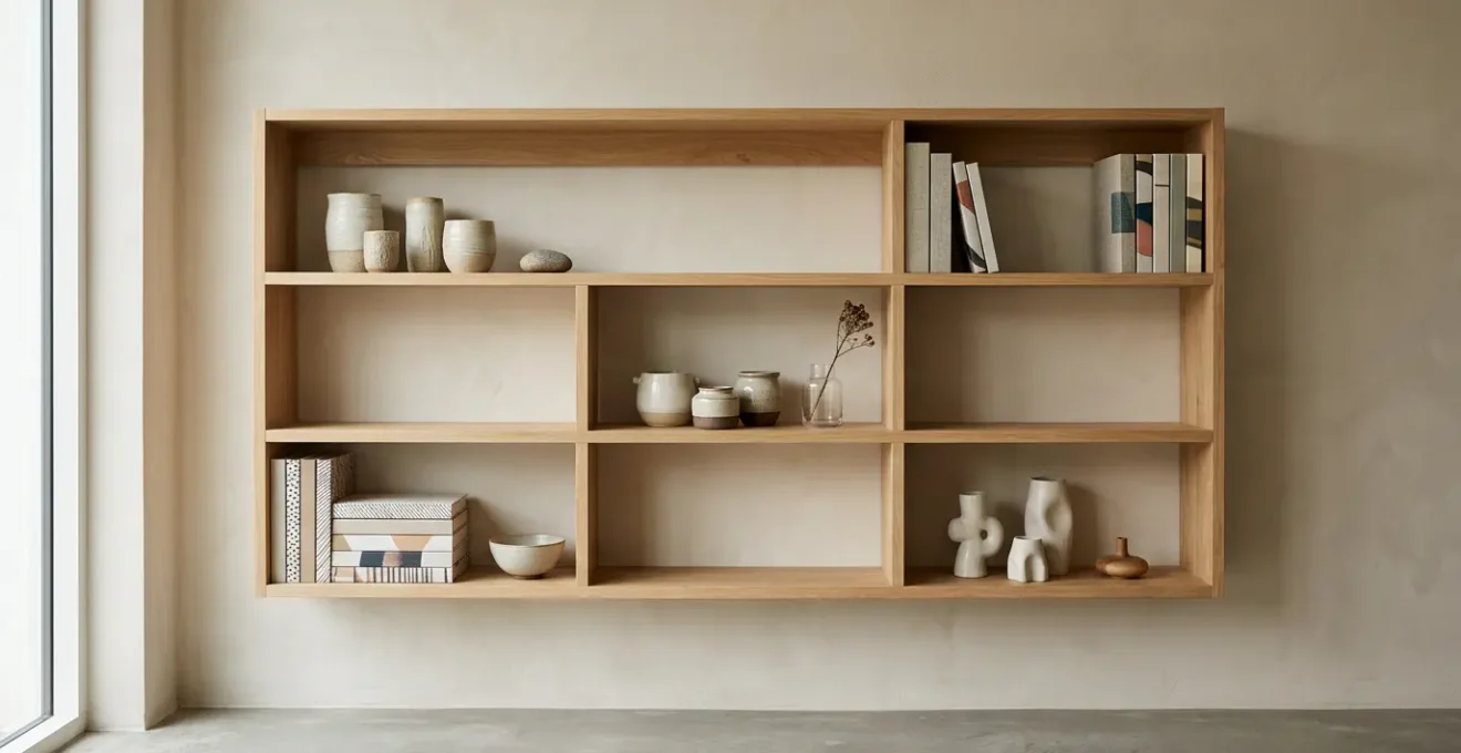
The term *Horror Vacui*, Latin for “fear of empty space,” perfectly describes the instinct to fill every visible surface with objects. It’s a natural impulse, driven by the belief that emptiness equates to incompleteness. In styling, however, this is a fundamental mistake. The most sophisticated and impactful arrangements are not defined by what is present, but by the deliberate use of what is absent. Negative space, or the “breathing room” around your decor, is an active and powerful design element.
As the image above demonstrates, negative space serves several critical functions. First, it prevents visual clutter and creates a sense of calm and order. An overstuffed shelf assaults the eye with information, making it impossible to appreciate any single item. By contrast, an object surrounded by empty space is given prominence and respect. The emptiness acts as a frame, drawing the eye toward the object and highlighting its form, texture, and color. As the experts at Home-Designing note, “Space is a design choice… It allows the eye to rest, and helps your favorite pieces stand out.”
Embracing negative space requires a shift in mindset. You must learn to see emptiness not as a void to be filled, but as a luxury. It signals a quiet confidence in your selections. It says that the pieces you’ve chosen are so special they don’t need to shout over a crowd; they can speak for themselves in the quiet of a well-composed space. A shelf that is 30% empty often looks far more expensive and curated than one that is 100% full.
How to Use Accents to Direct the Eye in a Beige Living Room?
A monochromatic space, such as an all-beige or neutral living room, presents a unique styling challenge. Without the contrast of bold color, how do you create visual interest and guide the viewer’s eye? The answer lies in a more subtle but equally powerful tool: texture. When color is quiet, texture speaks volumes. By creating a tactile dialogue between different surfaces, you can build layers of depth and sophistication that prevent a neutral palette from feeling flat or boring.
Think of your open shelves as a laboratory for textural experimentation. Juxtapose elements with opposing qualities: the rough, matte finish of an unglazed ceramic pot against the smooth sheen of a brass object; the nubby weave of a linen-bound book next to the cool, hard surface of a marble tray. Each material catches light differently, creating subtle shifts in shadow and highlight that engage the eye. This principle is backed by science; research on interior spatial perception demonstrates that natural and textured materials are consistently perceived as more spacious and inviting than smooth, uniform surfaces like concrete.
The goal is to create a rhythm. Place a dominant textural element—like a large wooden bowl—as an anchor. Then, sprinkle smaller, complementary textures around it to create a path for the eye to follow. A small, spiky sea urchin shell, a stack of books with rough, deckled edges, and a draping string of wooden beads can all work in concert to build a rich, layered story without ever needing to raise their voice in color.
How to Secure Heavy Ceramic Art on Floating Shelves Without Risk?
Floating shelves offer a clean, minimalist aesthetic, but their lack of visible supports can cause anxiety, especially when displaying heavy, valuable items like ceramic art. A successful installation is not just about aesthetics; it is fundamentally about structural integrity. The most critical factor is ensuring your shelves are anchored correctly, not just to the drywall, but directly into the wall studs—the vertical wooden beams that form the frame of your house.
A properly installed bracket is the unsung hero of any floating shelf display. High-quality floating shelf brackets can support 45 to 50lbs per stud they are attached to. Therefore, locating these studs with a stud finder is a non-negotiable first step. Securing brackets into drywall alone is a recipe for disaster, as it simply cannot bear significant weight over time. Beyond the anchor point, the depth of the bracket itself is crucial. The bracket should extend at least half, and ideally two-thirds, of the way into the shelf’s depth to prevent it from tipping forward under load.
Once the shelf is securely mounted, strategic placement of your objects adds another layer of security. Place your heaviest pieces, like a large stoneware vessel, closer to the wall, directly over the bracket locations where the support is greatest. Lighter, smaller items can then be arranged toward the front. For extra peace of mind with irreplaceable art, a small, clear dab of museum gel or putty on the base of the object creates an invisible, reversible bond that protects against accidental bumps, vibrations, or shifting.
Action Plan: Safe Installation of Heavy Ceramics
- Attach brackets to wall studs: Locate studs using a stud finder and secure brackets directly into them for maximum support.
- Ensure bracket depth ratio: Use brackets that are at least half the depth of your shelf to provide adequate support and prevent tipping.
- Distribute weight strategically: Place heavier ceramic pieces close to the wall where shelf support is strongest, with lighter objects toward the front edge.
- Use museum gel for stability: Apply clear museum gel or putty to the base of valuable ceramics to prevent accidental knocks or vibrations.
- Test capacity gradually: Start with lighter items and incrementally add weight to ensure the shelf maintains stability before placing heavy art pieces.
The Storage Mistake That Consumes 20% of Your Visual Floor Space
A common but critical mistake in home styling is treating all storage as equal. Bulky, floor-bound furniture—low credenzas, wide media consoles, and chunky bookcases—can visually “eat” a significant portion of your floor space. While providing storage, they create a heavy, low horizon line that can make a room feel smaller and more cramped. By drawing the eye downward, they anchor the room’s energy at floor level, effectively shrinking the perceived volume of the space.
The solution is to leverage verticality. Shifting storage upward onto wall-mounted open shelves does more than just free up the floor; it fundamentally alters the room’s perceived dimensions. Open shelving draws the eye upward, creating a sense of height, airiness, and expansion. This isn’t just a stylistic preference; it’s a perceptual phenomenon. As a matter of fact, according to a 2024 study on spatial perception, the presence of strong vertical elements and clear views significantly increases how spacious an environment feels. By exposing the floor underneath, you create an uninterrupted plane that makes the entire room feel larger.
The concept of visual weight is also key. As designer Stevie Storck explains, “It makes good sense to place larger, heavier and/or more densely spaced objects on the lower shelves and smaller, lighter items with more negative space near the top.” This mimics our natural experience of gravity and creates a display that feels balanced and stable. A top-heavy arrangement feels precarious and visually unsettling. By using open shelving thoughtfully, you are not just organizing objects; you are sculpting the very perception of the space you inhabit.
Key takeaways
- The Power of Odd Numbers: Grouping objects in threes or fives creates a dynamic tension that is more engaging and sophisticated than symmetrical pairs.
- Curation is Subtraction: The most impactful styling comes from a disciplined editorial process—knowing what to remove is more important than knowing what to add.
- Embrace Negative Space: Empty space is not a void to be filled; it is an active design element that gives objects room to breathe and creates a sense of calm and luxury.
How to Distinguish Authentic Studio Pottery From Mass-Produced Mimics?
In a world of mass production, owning a piece of authentic, handmade studio pottery is a mark of a true connoisseur. These objects carry the touch of the artist’s hand and a unique character that can never be replicated by a machine. However, as the appreciation for artisan goods has grown, so has the prevalence of convincing mass-produced mimics. Distinguishing the real from the replica requires more than a glance; it requires a tactile investigation and an eye for the “perfect imperfections” that signify true craftsmanship.
The first and most telling clue is often found on the bottom of the piece. Turn it over. An authentic, wheel-thrown pot will almost always have an unglazed foot or base ring where it sat in the kiln. This area should feel slightly rough, revealing the natural color and texture of the clay body. A mass-produced piece, often slip-cast in a mold, will typically be glazed over entirely or have a perfectly smooth, uniform base that feels chalky rather than earthy. This is the first test of provenance.
Beyond the base, look for signs of human touch across the entire object. Are there faint, concentric “throwing rings” visible on the interior? Are there slight variations or visible brushstrokes in the painted decoration? Can you spot the tiny pin-prick “tong marks” where the artisan held the piece during glazing? These are not flaws; they are the fingerprints of the creative process. A machine-made item is defined by its uniformity and flawless repetition. A handmade piece is defined by its subtle, singular asymmetries. Learning to spot these differences elevates you from a consumer to a collector.
- Examine the unglazed base: Turn the piece upside down and check for a rough, unglazed area showing the natural clay color.
- Look for visible brushstrokes: Authentic hand-painted ceramics will show individual brush strokes with slight variations.
- Identify perfect imperfections: Look for subtle asymmetry, unique glaze drips, or faint throwing rings that indicate human touch.
- Check for tong marks: Small dots near the rim often indicate where artisans held the piece during glazing.
- Inspect the maker’s mark: Examine the texture of the foot and look for indentations from the potter’s wheel that are absent in mold-made pieces.
By shifting your perspective from decorating to curating, your shelves will transform. They cease to be mere surfaces for stuff and become stages for visual stories—a quiet, confident reflection of your own evolving taste. Start today by choosing one shelf and beginning your own curatorial edit.