Warming a north-facing room isn’t about choosing a generically ‘warm’ color; it’s about selecting a neutral with the correct pigment chemistry to optically counteract the cool, blue-toned quality of the light.
- The phenomenon of “metamerism” explains why a neutral paint like grey can shift to purple or blue in the cool light of a northern exposure.
- A color’s Light Reflectance Value (LRV) and its saturation must be balanced; a dark, saturated color can feel sophisticated, not claustrophobic, if used correctly.
Recommendation: Diagnose the specific temperature (Kelvin) and quality (CRI) of your room’s natural and artificial light before ever selecting a paint swatch. Light is the active ingredient that determines the final color.
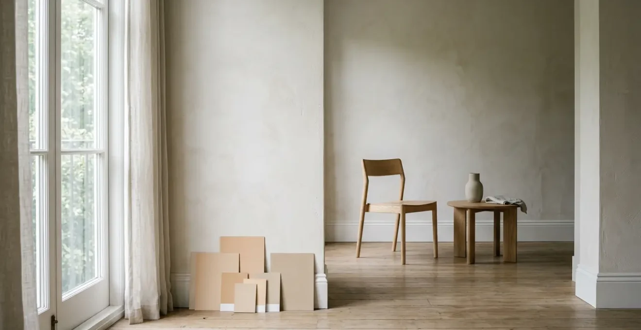
The despair is a familiar one for any renovator of a period property. You select a sophisticated, nuanced grey, imagining a calm, elegant sanctuary. Yet, in the cool cast of the morning light, your walls reveal a chilling secret: they have taken on a distinctly purple or blue hue. This is the classic dilemma of the north-facing room, a space bathed in indirect, cool, and often limited natural light. The conventional wisdom—to simply splash a warm beige or a sunny yellow on the walls—is a blunt instrument that often fails to address the subtleties of the problem, resulting in a color that feels discordant or unsophisticated.
This approach ignores a fundamental truth of interior architecture: color is not a static property but a dynamic interplay between pigment and light. The fear of creating a space that feels cold, sterile, or smaller than it is, is valid. But the solution lies not on the surface of the color wheel, but within the hidden pigment chemistry of the paint itself. It requires a more clinical, scientific approach that considers how complex neutral shades are formulated and how they will perform under specific lighting conditions. It is less a matter of decoration and more a question of optical engineering.
This guide moves beyond generic advice to provide a framework for mastering color in challenging lighting. We will deconstruct the science of why colors shift, how to build a cohesive palette that flows through your home, and how architectural elements like lighting and paneling can fundamentally alter spatial perception. By understanding the ‘why’ behind the ‘what’, you can select undertones that don’t just fight the cold, but actively and elegantly transform it into a source of balanced, intentional warmth.
To navigate these complex interactions, this article breaks down the core principles of color and light manipulation. The following sections provide a structured path from understanding pigment science to applying it through strategic lighting and architectural choices.
Summary: A Technical Guide to Warming a North-Facing Room
- Why Your Grey Paint Looks Purple in the Morning Light?
- How to Create a Cohesive Whole-House Color Palette Without Clashing?
- Warm Greige or Cool Taupe: Which Neutral Suits Dark Wood Floors?
- The Saturation Mistake That Makes Small Rooms Feel Claustrophobic
- Problem & Solution: Brightening a Windowless Hallway With Pigment Science
- Why Single-Source Overhead Lighting Increases Visual Fatigue in Home Offices?
- Why Vertical Paneling Changes the Perceived Volume of Small Rooms?
- How to Zone an Open-Plan Living Room Using Only Lighting Circuits?
Why Your Grey Paint Looks Purple in the Morning Light?
The frustrating phenomenon of a carefully chosen grey appearing lavender, or a beige turning a sickly green, is not a fault of the paint but a scientific principle known as metamerism. This occurs when two colors appear to match under one light source but differ under another. A north-facing room’s cool, blue-biased daylight is a notorious catalyst for this effect. The issue lies in the paint’s complex pigment chemistry. Modern neutrals are rarely made from a single pigment; a sophisticated greige might contain traces of red, yellow, blue, and black to achieve its specific nuance.
When the cool northern light, which is low in red and yellow wavelengths, hits the wall, it fails to reflect those warm undertones present in the paint. Instead, it amplifies the underlying blue or violet pigments, causing the color to shift dramatically. According to color science research, whites, greys, beiges, and mauves are particularly susceptible to this metameric failure. To counteract this, one must select a color with a strong enough warm undertone (yellow, red, or even green) to remain stable and balanced when subjected to cool light.
This microscopic view of paint reveals the truth: what appears as a simple grey to the naked eye is a complex matrix of varied color pigments. It is this complexity that gives a color its depth but also its potential to shift. The solution, therefore, is not to fear complex neutrals but to understand their composition and select one whose undertone is engineered to thrive in cool light, providing an optical correction that ensures the perceived color remains true to your intention.
How to Create a Cohesive Whole-House Color Palette Without Clashing?
Creating a harmonious flow of color throughout a property, especially a period home with distinct rooms, requires a unifying element. The most effective strategy is to establish a “master undertone” that acts as a chromatic thread connecting each space. This doesn’t mean every room must be the same color, but that the colors chosen should share a common pigment base, ensuring they relate to one another in a sophisticated way, even if they vary in depth and saturation.
This process begins by analyzing the fixed elements of your home: flooring, stone fireplaces, kitchen cabinetry, and significant architectural details. These elements have their own inherent undertones—a dark wood floor might have a red-orange undertone, while a slate hearth has a cool blue-green one. Your master undertone should harmonize with these dominant, unchangeable finishes. As the Farrow & Ball design team notes, the context is paramount:
Location (think woodsy versus coastal versus desert environments) and the way natural lighting changes throughout the day influence how a paint color appears on a wall.
– Farrow & Ball Design Team, Farrow & Ball – How Light Affects Colour
Once you identify the primary undertone of your fixed elements (e.g., a subtle green), you can select a family of paints that share it. A light, airy green-beige could be used in the north-facing living room, a deeper olive in a cozy study, and a pale, almost-white with a hint of green in the hallways. This creates a subtle, expert-level cohesion that feels intentional and custom, preventing the jarring effect of colors clashing from room to room. The key is to test large samples in every room, observing how the master undertone performs under each unique lighting condition throughout the day.
Your Action Plan for a Cohesive Palette
- Identify Fixed Elements: Inventory all unchangeable surfaces (floors, countertops, brick, tile). Photograph them in natural light to diagnose their dominant undertone (e.g., red, yellow, green, blue).
- Select a Master Undertone: Choose a single undertone that harmonizes with the most significant fixed elements. This will be the “chromatic thread” for your entire palette.
- Gather a “Family” of Colors: Collect paint chips from light to dark that all share your chosen master undertone. This gives you a range of values to work with.
- Test In Situ at Scale: Paint large (1m x 1m) sample boards. Move them around each room over a 48-hour period, observing them in morning, noon, evening, and artificial light.
- Finalize the Flow: Assign colors from your “family” to each room based on the desired mood and the light performance, ensuring a seamless transition from one space to the next.
Warm Greige or Cool Taupe: Which Neutral Suits Dark Wood Floors?
The pairing of wall color with dark wood flooring is a critical decision that dictates the entire mood of a room. A common assumption is that warm walls are needed to balance dark floors, but the reality is more nuanced. In fact, according to flooring industry specialists, around 80% of customers choose cool color tones for walls with dark hardwood. This counter-intuitive choice often creates a more sophisticated, balanced, and modern aesthetic by providing contrast rather than trying to blend in. The success of this pairing, however, hinges entirely on undertone alignment.
The choice between a warm greige (gray with beige/yellow undertones) and a cool taupe (gray with pink/purple undertones) depends on the specific undertone of the wood itself. This creates a “chromatic dialogue” between the horizontal and vertical planes of the room. Red-toned woods like cherry or mahogany can be overly warmed and appear dated when paired with a yellow-based greige. A cooler neutral with a slight green undertone is a more effective choice, as green sits opposite red on the color wheel and will optically neutralize the wood’s intensity, making the space feel more balanced.
Case Study: Greige Coordination with Dark Wood Floor Undertones
To achieve a versatile and timeless look with dark hardwood, interior designers often turn to complex greiges that contain both warm and cool pigments. As detailed in an analysis of wall colors for dark wood floors, paints like Sherwin Williams Agreeable Gray or Benjamin Moore Revere Pewter are successful because their undertones can be manipulated. For instance, with yellow-toned oak floors, a balanced warm greige harmonizes beautifully. However, for red-toned cherry floors, a greige with a subtle green undertone, like the ones often found in the Revere Pewter family, is recommended. This green pigment actively calms the red in the wood, creating a serene and cohesive environment instead of a clash of warm tones.
Ultimately, a “cool” wall color can make a room with dark floors feel brighter and larger by creating crisp contrast, while a well-chosen warm greige can create a cozier, more enveloping feel. The decision rests on first correctly identifying the wood’s undertone and then choosing a wall color that either neutralizes or harmonizes with it intentionally.
The Saturation Mistake That Makes Small Rooms Feel Claustrophobic
A pervasive myth in interior design is that small rooms or those with poor light must be painted white or a very light color to feel larger. This often leads to sterile, uninspired spaces. The feeling of claustrophobia is not caused by color depth alone, but by a misunderstanding of the relationship between saturation and Light Reflectance Value (LRV). Saturation refers to the intensity or purity of a color, while LRV measures how much light a color reflects. A highly saturated, dark color is not automatically a mistake.
The critical error is choosing a color with both high saturation and a low LRV without a clear strategy. According to the Light Reflectance Value measurement scale, an LRV below 50 will absorb more light than it reflects. This can make a room feel heavy and enclosed if not balanced with excellent artificial lighting and reflective surfaces. However, this effect can be used to one’s advantage in what is known as the “jewel-box” strategy, where a small space like a powder room or study is intentionally enveloped in a deep, saturated color to create a dramatic, intimate, and luxurious atmosphere.
The nuance is often missed, as architectural paint specialists point out. It’s the ‘muddiness’ of a color, not just its depth, that can be problematic.
The ‘claustrophobic’ feeling often comes from a combination of high saturation and low LRV. A highly saturated color can still feel airy if its LRV is high, such as a vibrant lemon yellow versus a muddy mustard.
– Diamond Vogel Architectural Paint Specialists, Diamond Vogel – What is LRV?
Therefore, when selecting a color for a small or north-facing room, the question is not “is it dark?” but “is it clean or muddy?”. A clean, deep color like a rich navy blue or an emerald green, even with a low LRV, can feel expansive and elegant. A mid-tone, muddy color with grayed-out pigments is often the true culprit that makes a space feel undefined and oppressive.
Problem & Solution: Brightening a Windowless Hallway With Pigment Science
A windowless hallway presents a unique architectural challenge: it’s a transitional space that can easily feel like a dark, narrow tunnel. The typical solution of painting it stark builder’s white is often ineffective, as the lack of natural light can make the white appear flat and dingy. A more sophisticated approach uses pigment science and paint sheen to manipulate the perception of light and space. The goal is to maximize the reflection of artificial light and create an illusion of depth.
The first step is selecting a “clean” off-white. This means a white with a very high LRV and minimal gray or black undertones. According to ADA accessibility guidelines, an LRV value of 70 or higher is recommended for spaces with limited vision considerations, a standard that serves as an excellent benchmark for brightness in a hallway. A clean off-white with a subtle yellow or cream undertone will bounce artificial light warmly. The second step is strategic use of sheen. Painting the ceiling in a flat or matte finish will help it recede, while using a satin or semi-gloss on the trim and doors will catch the light, creating subtle highlights and defining the architecture.
The most impactful technique, however, is to treat the end wall of the corridor as a destination. By painting this single wall a slightly deeper or more saturated color than the side walls, you create a focal point. This draws the eye forward, giving the hallway a sense of purpose and a visual endpoint, which counteracts the tunnel effect. The result is a hallway that doesn’t just feel brighter, but also more thoughtfully designed and architecturally interesting, guiding movement through the home with an intentional use of color.
Why Single-Source Overhead Lighting Increases Visual Fatigue in Home Offices?
In a home office, particularly one within a north-facing room, the quality of light is paramount for both productivity and well-being. A common mistake is relying on a single overhead fixture, often called “general lighting.” This approach creates a high-contrast environment, with a bright pool of light directly below the fixture and deep shadows elsewhere. This forces the eye to constantly readjust as it moves from a bright screen to a shadowed document or a dark corner, leading to significant visual fatigue and headaches.
Furthermore, the quality of the light source itself is often overlooked. The Color Rendering Index (CRI) is a scale from 0 to 100 that measures a light’s ability to reveal the true colors of objects compared to natural daylight. Low-CRI lighting (typically below 80) can distort colors, making a space feel drab and unnatural, and can further contribute to eye strain. According to research on Color Rendering Index, lighting with a CRI of 80-90 in offices significantly reduces eye strain. For a home office where color accuracy and visual comfort are key, a CRI of 90+ is the professional standard.
The solution is a layered lighting scheme. This involves creating multiple circuits of light that serve different functions:
- Ambient Lighting: Soft, indirect light that provides a base level of illumination, often from recessed ceiling lights with diffusers or up-lighters.
- Task Lighting: A focused beam of light for specific activities, such as an adjustable desk lamp with a high CRI bulb for reading.
- Accent Lighting: Used to highlight architectural features or artwork, adding depth and visual interest to the room.
By combining these layers, you create a low-contrast, visually comfortable environment where light is distributed evenly, eliminating harsh shadows and reducing the strain on your eyes. This is essential for a productive and healthy workspace.
Why Vertical Paneling Changes the Perceived Volume of Small Rooms?
Beyond paint and lighting, architectural modifications offer a powerful tool for manipulating the perception of space. In rooms with low ceilings or a small footprint, vertical paneling is a highly effective technique for creating an illusion of height and volume. This works through a principle of visual psychology known as forced perspective, where strong, repeating lines guide the eye in a specific direction, tricking the brain into perceiving greater distance.
When vertical lines—whether from beadboard, board and batten, or slim wood slats—are applied to a wall, they create an undeniable upward visual pull. The eye naturally follows these lines from the floor to the ceiling, exaggerating the vertical dimension of the room. This effect is amplified when the paneling is painted in a satin or semi-gloss finish, as the slight sheen catches the light and creates subtle highlights and shadows along the edges of each plank, further enhancing the linear effect. For maximum impact, the paneling should extend as high as possible, ideally up to the ceiling or to a high picture rail.
This architectural trick is not about physically adding space, but about directing the occupant’s gaze. By emphasizing verticality, you de-emphasize the room’s limited horizontal dimensions. The result is a space that feels grander, more elegant, and less compressed. It’s a classic technique used in period properties to add character and a sense of stature to smaller ancillary rooms, proving that clever design can be more impactful than the square footage itself.
Key Takeaways
- The phenomenon of “metamerism” (color shifting in different light) is the primary challenge in north-facing rooms; combat it by choosing neutrals with strong warm undertones (yellow, green, red).
- A color’s performance depends on two metrics: its saturation (intensity) and its Light Reflectance Value (LRV). A low LRV color isn’t bad if its saturation is “clean” rather than “muddy”.
- The quality of artificial light is as critical as the paint. Use a layered lighting scheme and ensure all bulbs have a high Color Rendering Index (CRI 90+) and the correct color temperature (Kelvin) for the desired mood.
How to Zone an Open-Plan Living Room Using Only Lighting Circuits?
In modern living, the open-plan space presents a design challenge: how to define distinct functional zones (living, dining, kitchen) without erecting walls. The most sophisticated method is to use the same wall color throughout the space but manipulate its appearance with different lighting circuits. This technique leverages the principles of metamerism and light temperature to create “zones” of color and mood from a single paint choice. The key is to select a highly complex neutral—like a greige with both warm and cool undertones—and then “activate” those undertones with light.
Light temperature is measured in Kelvin (K). A lower Kelvin temperature (around 2700K) produces a warm, yellow-amber light similar to an incandescent bulb or candlelight. A higher temperature (4000K-5000K) produces a cool, crisp, blue-toned light closer to daylight. As spectral reflectance analysis shows, an object viewed under incandescent light (2700K) will appear redder and warmer than under daylight. By installing separate lighting circuits for each zone, you can radically change the perceived color of the walls.
Paint color theory specialists highlight how this creates a dynamic environment.
A greige with both warm and cool undertones will appear more beige under warm light and more grey under cool light, dramatically enhancing the zoning effect without changing the paint.
– Paint Color Theory Specialists, The Land of Color – LRV Light Reflectance Value Guide
For example, in a dining area, you might use a circuit of 2700K pendant lights to create an intimate, warm glow that brings out the beige undertones in your greige walls. Simultaneously, in the adjacent kitchen prep area, a circuit of 4000K recessed lights provides a clean, functional light that makes the same wall color appear as a cooler, crisper gray. This allows you to maintain architectural cohesion while creating distinct atmospheres, all through the invisible yet powerful tool of light.
By ceasing to view paint as a simple coating and instead treating it as one half of a dynamic system with light as its partner, you unlock a new level of design control. The next logical step is to perform a thorough audit of your own home’s lighting, diagnosing its current Kelvin temperatures and CRI ratings to inform your future architectural and design decisions.