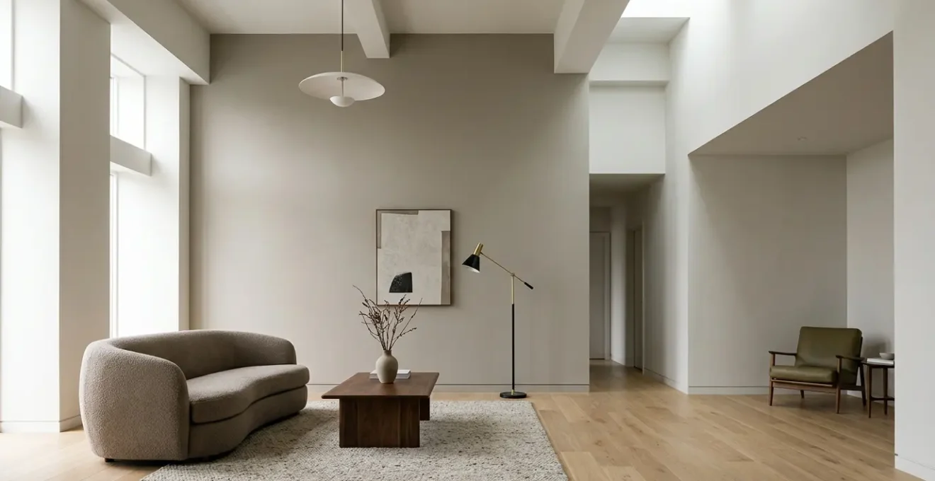
An architect’s preference for matte paint is not an aesthetic whim; it’s a calculated decision based on the physics of light and a commitment to surface integrity.
- Matte finishes absorb light, effectively erasing drywall imperfections that glossier sheens amplify.
- True durability doesn’t come from a shinier paint, but from advanced washable matte formulas engineered for high-traffic areas.
Recommendation: Achieving this flawless look depends on precise application techniques and a strict, non-abrasive cleaning protocol to prevent irreversible damage to the paint’s microscopic texture.
Every design-conscious homeowner has felt the frustration. You’ve invested in creating a modern, sophisticated living space, only to have the light catch every minor bump, seam, and imperfection in your drywall. The pursuit of a seamless, monolithic wall surface can feel like an impossible goal. The conventional wisdom often points towards eggshell or satin finishes, praised for their supposed cleanability and durability, but these sheens frequently betray you, highlighting the very flaws you wish to hide.
This common advice, however, overlooks a fundamental principle understood by high-end painters and architects. The solution isn’t about finding a compromise in sheen; it’s about mastering the material itself. But what if the key to a truly luxurious, flawless finish wasn’t in its ability to be scrubbed, but in its ability to control light? This is where the architectural preference for matte emerges. It’s a choice rooted not in trends, but in the material science of paint and its profound impact on spatial perception.
Choosing a matte finish is a commitment to quality that goes beyond color. It demands an uncompromising approach to application and an understanding of its unique properties. This guide is built from a professional contractor’s perspective. We will deconstruct the technical reasons behind matte’s superiority for imperfect surfaces, provide the non-negotiable rules for application on large surfaces, and detail the precise maintenance protocols required to preserve its perfect, velvety finish for years to come. This is how you move from a painted room to an architectural space.
This article details the professional-grade knowledge required to successfully specify and maintain a matte finish. Explore the sections below to understand the science, technique, and color theory that deliver a truly flawless result.
Summary: Why Matte Finishes Are the Professional Choice for Modern Interiors
- Why Matte Paint Hides Drywall Imperfections Better Than Eggshell?
- How to Roll Matte Paint on Large Ceilings Without Visible Streaks?
- Washable Matte vs Traditional Flat: Is the Extra Cost Worth It for Hallways?
- The Cleaning Error That Ruins Dark Matte Walls in Seconds
- When to Recoat Matte Paint: The Drying Rule Professionals Never Break
- Why Vertical Paneling Changes the Perceived Volume of Small Rooms?
- Warm Greige or Cool Taupe: Which Neutral Suits Dark Wood Floors?
- Which Paint Undertones Make a North-Facing Room Feel Warmer?
Why Matte Paint Hides Drywall Imperfections Better Than Eggshell?
The superiority of a matte finish in concealing imperfections is not an aesthetic opinion; it is a principle of physics. Unlike glossier sheens like eggshell or satin that act like a low-grade mirror, a matte surface is microscopically porous and rough. When light from a window or fixture strikes a high-sheen paint, it reflects back at a uniform angle, creating sharp, defined highlights. This phenomenon, known as specular reflection, effectively traces the edges of every nail pop, seam, or undulation in the drywall, making them glaringly obvious.
A true matte or flat finish, by contrast, operates on the principle of light absorption and diffuse reflection. Its textured surface scatters light rays in countless different directions. Instead of reflecting a clear image of the light source, it ‘swallows’ the light, creating a soft, uniform appearance that the eye perceives as a single, flawless plane. This is why flat/matte finishes absorb light rather than reflect it, a quality that makes them the uncompromising choice for areas with imperfect drywall or where a tranquil, non-distracting background is desired.
An eggshell finish, with its slight sheen, represents a flawed compromise. It attempts to offer washability but fails at the primary task of creating a perfect canvas. It will always catch light at certain angles, revealing the very textures you’re trying to eliminate. For a truly high-end, architectural result, there is no substitute for the light-diffusing properties of a quality matte paint. It doesn’t just cover the wall; it manipulates perception to deliver the illusion of perfect flatness.
How to Roll Matte Paint on Large Ceilings Without Visible Streaks?
Painting a large ceiling with matte paint is a high-stakes task. Its light-absorbing qualities, so effective at hiding wall flaws, can be unforgiving when it comes to application errors like roller marks and streaks, often called “lap marks.” The key to a monolithic, streak-free ceiling is not speed, but a systematic process that manages the paint’s drying edge. Professionals achieve this through a combination of proper tools, technique, and lighting.
First, abandon the idea of random rolling. Work in manageable sections, typically no more than 3×3 or 4×4 feet. Apply the paint in a ‘W’ or ‘M’ pattern to distribute it evenly across the section, then immediately back-roll over the same area with straight, parallel strokes to smooth it out. The critical rule is to always maintain a wet edge. This means your roller must always be blending back into paint that is still wet, preventing the visible overlap that occurs when fresh paint is applied over a partially dried section. This technique requires a consistent pace without long breaks.
The right equipment is non-negotiable. A 3/8-inch nap roller is the standard for most smooth ceilings, as it holds enough paint for good coverage without introducing excessive texture. Furthermore, your lighting setup is as important as your roller. Do not rely on the room’s central fixture. Use a powerful work light placed on the floor at a low, sharp angle to the ceiling. This “raking light” will reveal any imperfections and streaks as you work, allowing you to correct them before the paint dries, which is impossible to do later.
As you can see in the professional setup above, the angled light makes every bit of surface texture visible. This allows the painter to ensure a perfectly uniform coat. By combining the wet-edge technique with the right roller and critical side lighting, you can produce a ceiling that appears as a single, unbroken plane of color, free of any distracting application marks.
Washable Matte vs Traditional Flat: Is the Extra Cost Worth It for Hallways?
The decision between a traditional flat paint and a modern “washable matte” is a critical one, especially for areas like hallways that combine a need for aesthetic perfection with the reality of high traffic. Historically, any attempt to clean a standard flat paint resulted in removing pigment and leaving a permanent mark. This made it suitable only for ceilings and formal, low-traffic rooms. However, paint technology has evolved significantly, creating a new category of premium matte paints engineered for durability.
The extra cost of a washable matte—often a 15-25% premium—is a direct investment in advanced binder technology. Traditional flat paints use larger, less tightly packed pigment particles, which creates their excellent light-hiding properties but leaves the surface porous and fragile. Washable mattes employ smaller, more tightly bound polymer binders that create a more resilient, less porous surface at a microscopic level. This formulation allows the paint to withstand gentle cleaning with a soft cloth and mild detergent without scuffing or losing pigment.
For a high-traffic area like a hallway, this premium is not a luxury; it’s a necessity for longevity. While a traditional flat offers the best imperfection hiding, its lack of durability makes it impractical. A washable matte provides a finish that is nearly as effective at hiding flaws but can actually be maintained. The following comparison, based on data from professional paint suppliers, clarifies the trade-offs.
| Feature | Traditional Flat Paint | Washable Matte Paint |
|---|---|---|
| Washability | Minimal – scrubbing removes pigment | Moderate – can tolerate mild soap and damp cloth |
| Durability | Low – scuffs appear easily | Higher – engineered with tighter binders |
| Imperfection Hiding | Excellent – best in class | Very Good – close second to flat |
| Touch-Up Ease | Excellent – blends seamlessly | Moderate – may show slight flashing |
| Cost | Lower | 15-25% premium |
| Best Use | Low-traffic, formal spaces | Hallways, high-traffic areas |
Ultimately, the extra cost for a washable matte in a hallway is worth it. It provides the sophisticated, non-reflective finish desired in modern design while offering the practical durability required for everyday life. It bridges the gap between pure aesthetics and functional performance.
The Cleaning Error That Ruins Dark Matte Walls in Seconds
The single biggest mistake a homeowner can make with a beautiful dark matte wall is to treat a scuff or stain like a problem on a normal, glossy surface. Reaching for a standard cleaner and scrubbing is the fatal error. This action doesn’t clean the wall; it permanently destroys the paint’s surface integrity through a process called burnishing.
This isn’t just a stain; it’s a physical alteration of the paint’s microscopic texture. As the PPG Refinish Technical Guide explains, the damage is irreversible:
Burnishing is when friction physically flattens the microscopic texture of the paint surface. This smoother area now reflects light differently, creating a semi-gloss patch that cannot be washed away.
– PPG Refinish Technical Guide, Matte Finish Care Guide
Once a dark matte wall is burnished, the only true fix is to repaint the entire wall from corner to corner. The “shiny spot” is a permanent scar. To avoid this catastrophic failure, a precise, non-abrasive cleaning protocol is mandatory. You are not scrubbing a surface; you are gently lifting a contaminant off a delicate texture. Any circular or aggressive motion will cause burnishing. The correct approach is a dabbing motion with minimal pressure.
Action Plan: The Pro-Grade Method for Cleaning Matte Walls
- Preparation: Prepare two buckets. Bucket 1 contains a solution of warm water and a few drops of a pH-neutral, clear dish soap. Bucket 2 contains only clean, warm distilled water for rinsing.
- Application: Dampen (do not soak) a clean, soft microfiber cloth in the soap solution from Bucket 1. Gently blot or dab the stained area. Use light, straight-line pressure only. Absolutely no scrubbing or circular motions.
- Rinsing: Immediately take a second clean cloth, dampen it with the plain water from Bucket 2, and gently dab the area again to lift any soap residue.
- Drying: Use a third, separate, clean dry microfiber towel to gently pat the area dry. This prevents water spots and streaks from forming as the water evaporates.
- Assessment: Step back and view the wall from multiple angles. If a slight mark remains, it is better to leave it than to risk burnishing the paint with a second, more aggressive attempt.
This two-bucket, three-cloth method may seem excessive, but it is the professional standard for preserving the integrity and beauty of a matte finish. It respects the material science of the paint and is the only way to ensure its longevity.
When to Recoat Matte Paint: The Drying Rule Professionals Never Break
With matte paint, timing is everything, especially when applying a second coat. A common amateur mistake is to recoat too soon. The paint may feel “dry to the touch,” but this is a misleading indicator. True readiness for a second coat isn’t about surface dryness; it’s about the paint having reached a sufficient stage of its curing process. Applying a second coat prematurely can re-dissolve the first layer, leading to a disastrous finish with streaks, uneven sheen, and poor adhesion.
Paint dries in stages. The initial stage is the evaporation of its liquid carrier (usually water in latex paints), which makes it feel dry. The critical second stage is curing, where the paint’s polymer chains chemically react and cross-link to form a hard, durable film. This process takes much longer than initial drying. If you apply a second coat while the first is still in a delicate, partially cured state, the solvents in the new paint can soften and lift the first layer, dragging it with the roller and ruining the finish.
The recoat window specified on the paint can (typically 2-4 hours) is the absolute minimum under ideal conditions (low humidity, moderate temperature). Professionals, however, rely on a more definitive test, especially with deep, rich matte colors that are particularly prone to issues.
Case Study: The Impact of Premature Recoating
A professional contractor documented that applying a second coat of a deep matte blue after just two hours, as per the can’s minimum guidance, caused the first layer to re-dissolve. The result was a streaky, uneven finish that had to be completely sanded down and redone. The contractor’s definitive rule, confirmed through experience on numerous projects, is to wait until the entire surface shows a uniform, “dead-flat” sheen when viewed from all angles with a raking light. Any patches of inconsistent sheen indicate uneven curing. Only when the surface is visually uniform from every perspective is it truly ready for the next coat, a process that can often take longer than the minimum recommended time, especially in humid or cool conditions.
Breaking this rule is a costly mistake. Patience is the most valuable tool when applying multiple coats of matte paint. Waiting for the paint to be truly ready ensures that each layer builds upon a stable foundation, resulting in the deep, flawless, and durable finish you expect.
Why Vertical Paneling Changes the Perceived Volume of Small Rooms?
In the hands of a skilled designer, paint and texture are tools to manipulate spatial perception. Vertical paneling, whether it’s traditional board and batten, shiplap, or modern slatted wood, is a powerful technique for altering the perceived volume of a room, especially a small one. Its effectiveness lies in a simple but profound optical illusion: it forces the human eye to travel upward.
When we enter a room, our eyes naturally scan horizontally, reading the width of the space. This can make a small or low-ceilinged room feel constrained. Vertical paneling introduces strong, repeating vertical lines that interrupt this horizontal scan. The eye is instinctively drawn to follow these lines from floor to ceiling. This upward visual movement creates an illusion of height, making the ceiling feel taller and the room more spacious and airy than its physical dimensions would suggest.
Painting this paneling in a matte finish enhances the effect. A matte surface absorbs light, allowing the clean, crisp shadows cast by the paneling’s edges to become the dominant visual element. This emphasizes the verticality and rhythm of the lines without the distraction of reflective hot spots you would get with a glossier paint. The combination of the physical direction of the panels and the light-absorbing quality of matte paint works in concert to trick the brain into perceiving more vertical space. It’s a classic architectural strategy to add a sense of grandeur and volume to a compact area, proving that a room’s feel is often more important than its square footage.
Warm Greige or Cool Taupe: Which Neutral Suits Dark Wood Floors?
Choosing the right neutral paint for a room with dark wood floors is a delicate balancing act of undertones. The floor is a dominant, fixed element, and the wall color must harmonize with its inherent warmth or coolness. Dark woods like walnut, ebony, or mahogany often contain strong red, orange, or deep brown undertones. The choice between a warm greige and a cool taupe will dramatically alter the room’s atmosphere.
A warm greige, which is a gray with a beige or yellow undertone, is often the most successful choice for dark wood floors. It works because it harmonizes with the warmth already present in the wood. The yellow or beige in the greige picks up on the red or orange tones in the flooring, creating a cohesive, inviting, and rich environment. This pairing feels intentional and enveloping, a classic strategy for a cozy and sophisticated space. It allows the richness of the wood to be a feature without creating a jarring contrast.
A cool taupe, which is a gray with a pink or purple undertone, can be more challenging. If the dark wood floor has very strong red or orange tones, a cool taupe can create a visual clash. The cool undertones in the paint will fight against the warm undertones in the wood, which can make the walls look slightly purple and the floors appear overly orange. However, if the dark wood is a cooler, more ashy brown or a near-black ebony with minimal red, a cool taupe can create a very chic, modern, and high-contrast look. It’s a bolder choice that requires a careful eye for color.
When in doubt, the safest and often most elegant choice is to lean into the warmth of the wood. A matte warm greige on the walls will provide a soft, light-absorbing backdrop that allows the natural beauty and depth of the dark wood floors to take center stage, creating a unified and timeless interior.
Key Takeaways
- Architectural Appeal: Matte finishes are chosen for their ability to absorb light and create a uniform, monolithic surface, effectively erasing drywall imperfections where gloss amplifies them.
- Formula Over Finish: True durability in high-traffic areas comes from specifying a premium ‘washable matte’ formula, not from compromising on a higher sheen like eggshell.
- Maintenance is Technique: Preserving a matte surface requires a strict, non-abrasive cleaning protocol (dabbing, not scrubbing) to prevent irreversible damage known as burnishing.
Which Paint Undertones Make a North-Facing Room Feel Warmer?
A north-facing room presents a specific challenge in interior design: the natural light it receives is cool, indirect, and has a subtle blue or gray cast. Attempting to warm up such a space by simply choosing a “warm color” like a basic yellow or beige can often backfire, resulting in a color that looks dull, greenish, or simply out of place. The professional approach is more nuanced; it’s about selecting colors with the correct warm undertones to actively counteract the cool quality of the light.
Think of it as color chemistry. The blue-tinted northern light will neutralize or wash out weak warm colors. To succeed, you need a color with a strong backbone of red, yellow, or pink in its undertone. This is why some of the most effective colors for north-facing rooms aren’t overtly warm, but are complex neutrals. For example:
- Cream or Ivory: Instead of a pure white, which can look stark and gray, a creamy white with a strong yellow undertone will bounce light around while neutralizing the coolness.
- Warm Grays and “Greiges”: A gray with a significant amount of yellow or red mixed in (a “greige”) will read as a soft, warm neutral rather than a cold, flat gray.
- Terracotta or Blush Tones: Colors with a clear red or pink undertone are exceptionally good at adding warmth and a welcoming glow to a room with cool light. Even a pale, dusty pink can feel more like a sophisticated neutral in this context.
The goal is not to fight the northern light, but to balance it. The warm undertones in the paint absorb the cool blue frequencies of the light, reflecting a warmer, more balanced, and inviting light back into the room. Using a matte finish for these colors further enhances the effect, as it creates a soft, velvety surface that diffuses this warmed light gently, avoiding any cold, reflective glare and making the entire room feel cozier and more luminous.
By understanding the material science of paint—from its light-absorbing properties and binder chemistry to the critical importance of color undertones—you can wield it as architects do: not just as a decorative layer, but as a fundamental tool to shape space, control light, and achieve an uncompromising standard of quality.